
Jordan Scavo
About Me
Hi there! My name is Jordan, and I'm a UX Designer based in the metro Atlanta area. I have a Bachelor of Science in Interactive Design and a minor in Technical Communication at Kennesaw State University.
My goal as a designer is to provide streamlined, intuitive, and meaningful experiences to users. Check out some of my work below!

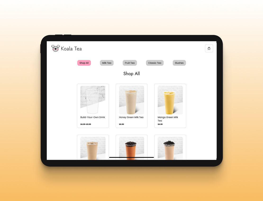
Tapioca Tech
A prototype for an iPad app that functions as a kiosk for a boba shop and allows customers to browse the products, customize their drinks, check out, and pay for their purchase.
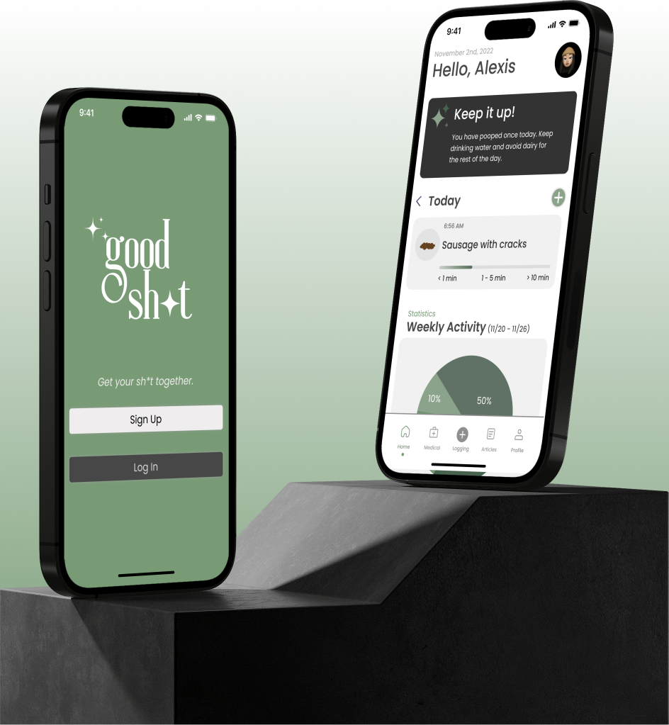
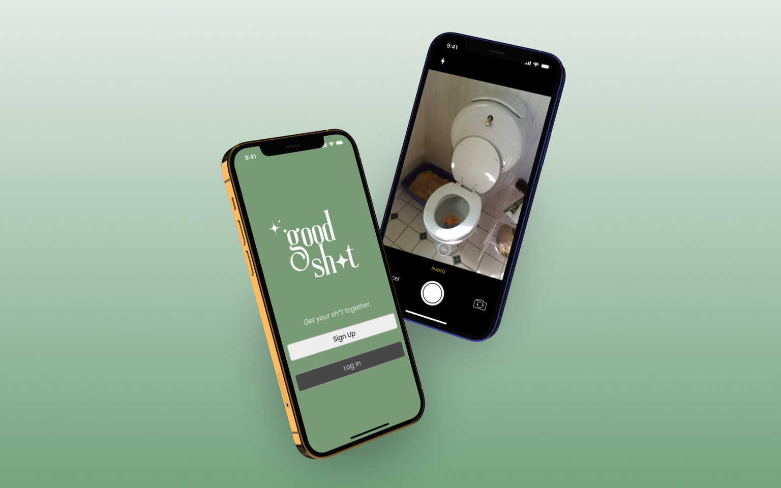
Good Sh*t
A prototype for a mobile app that gives users the ability to track their gut health, access to reliable information about gut health, and the capability to connect with professionals about their gut health.
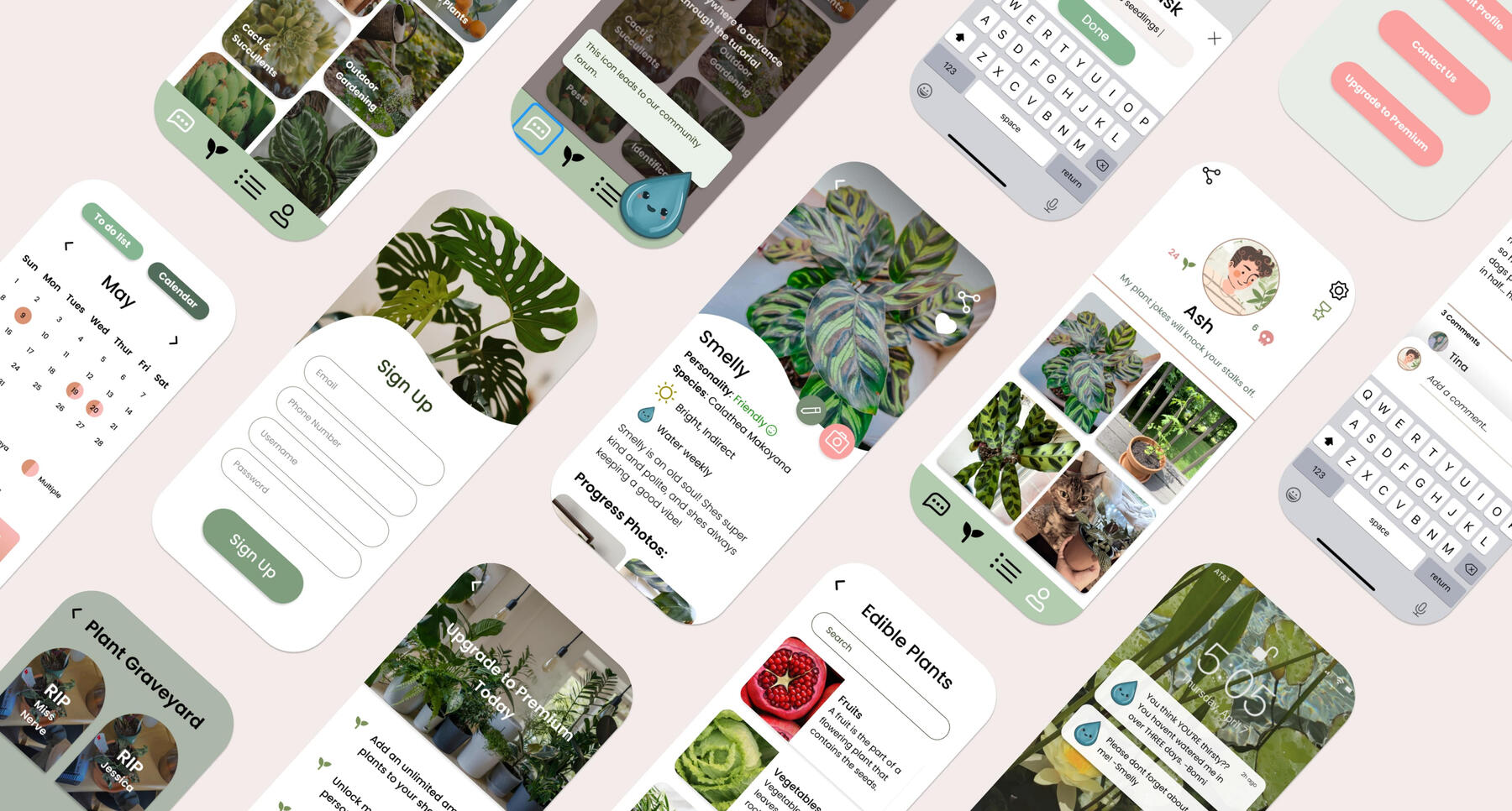
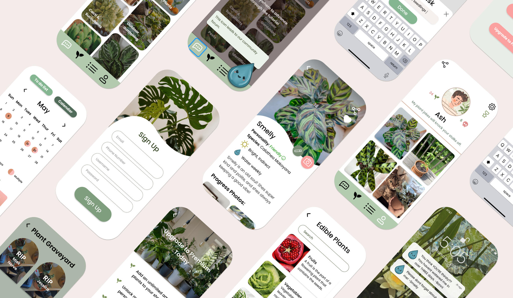
Watering Day
A prototype for a mobile app that is a plant owner's guide, allowing users to make watering schedules, checklists, and plant profiles, along with giving them access to community forums full of like-minded individuals.
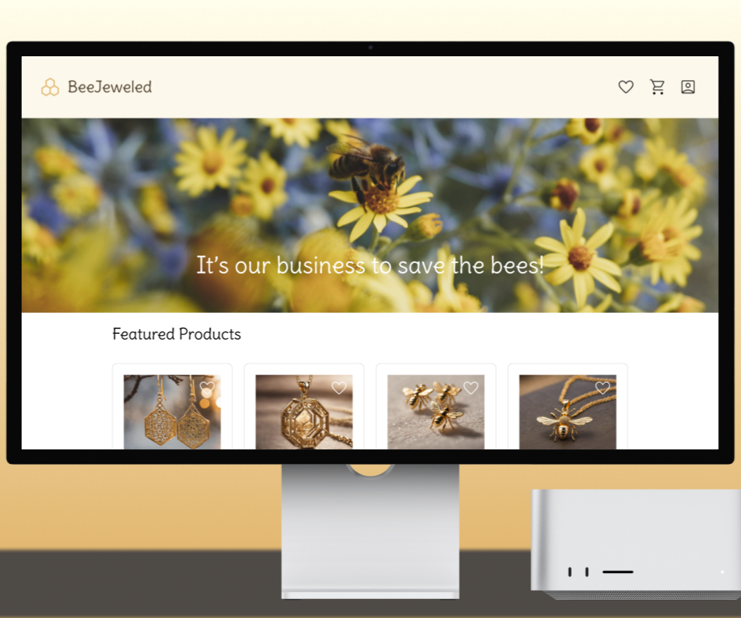
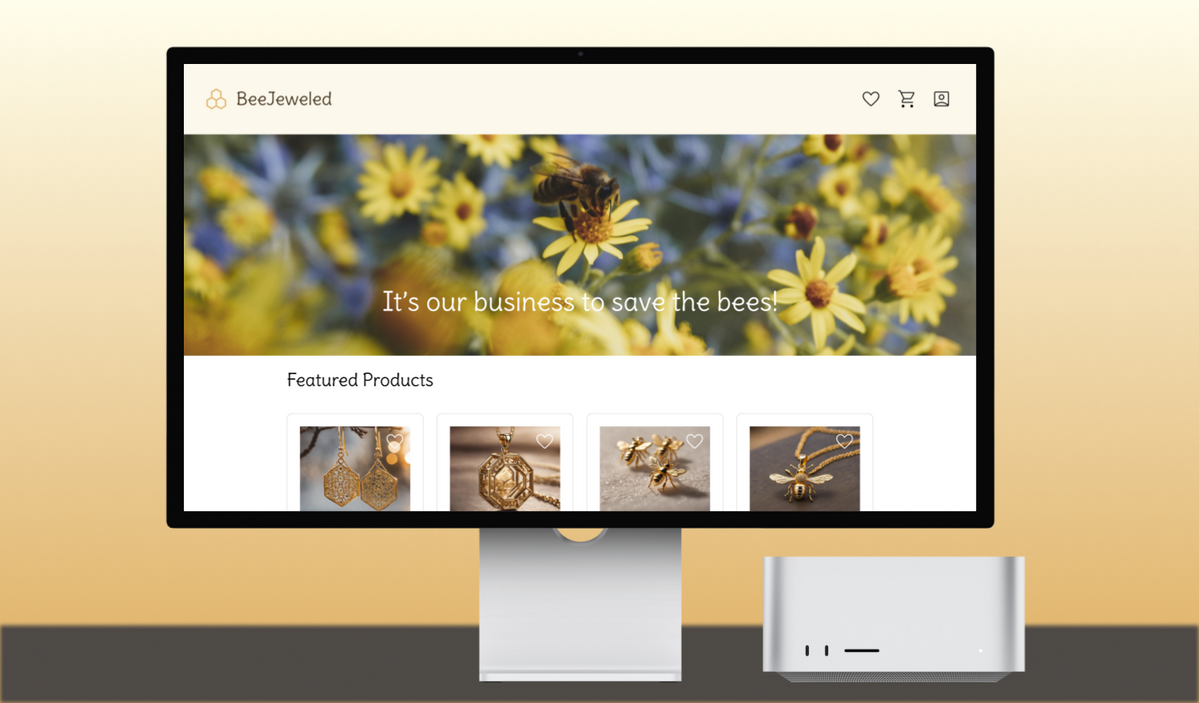
BeeJeweled
A prototype for a desktop e-commerce website that sells bee-themed jewelry and donates a portion of its profits toward the effort to save the bees.
Shiny by Nature Usability Test
A usability test conducted for the small online boutique, Shiny by Nature, where users can browse and purchase clothing

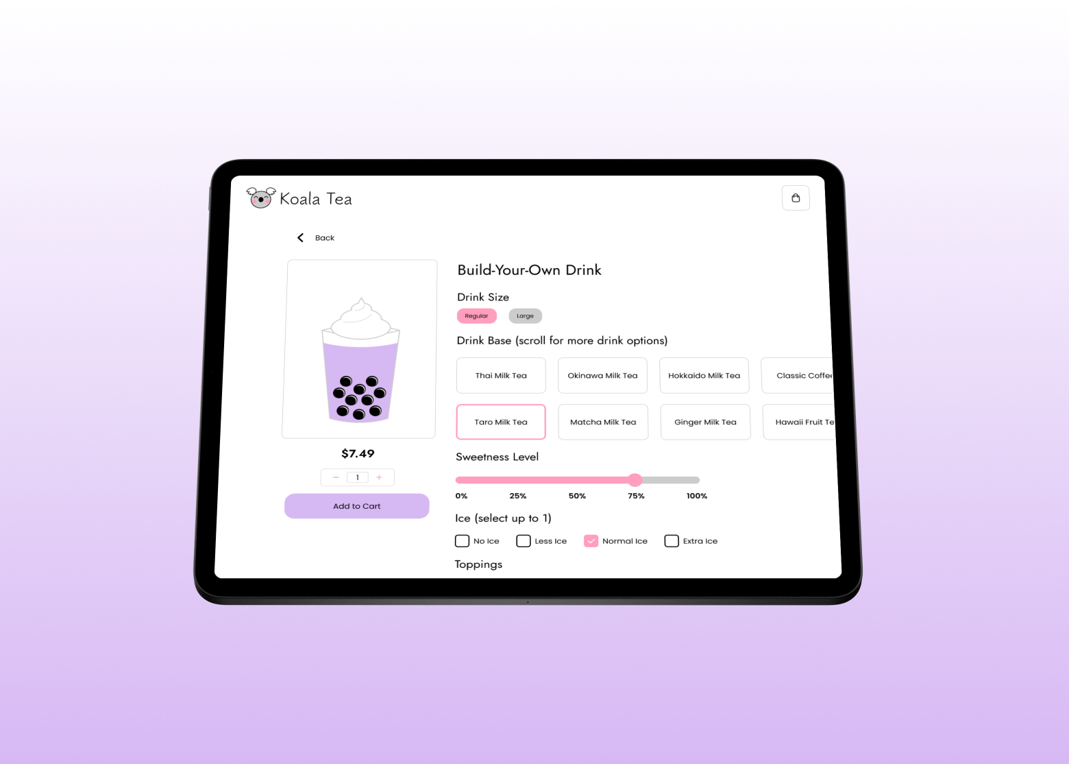
A boba shop kiosk with a creative twist
Executive Summary
Approach: Goal-Directed Design
Duration: 10 weeks
Overview
A prototype for a stylized boba shop kiosk that allows the user to:
- Browse menu items in various categories
- Customize and edit their drinks
- See visual changes made to their custom drinks
- Check out and pay
Tools: Figma, Adobe Illustrator
Challenges
- Making an interactive prototype that changes based on the input
- Creating interactions that calculate numbers like subtotal, tax, and total
- Designing an interface that is visually cohesive and matches the aesthetic associated with boba shops
Team:
- Jordan Scavo: team lead, UX researcher/designer
- Maddie Meyer: UX researcher/designer
- Mekayla Martin: UX researcher/designer
- Taylor Young: UX researcher/designer
- Thomas Burnett: UX researcher/designer
Introduction
Boba shops have gained a lot of popularity in the US within the past decade, largely in part due to East Asian media becoming more mainstream among the population. While some of these shops have patrons come to the counter to give their order to an employee, some boba shops are trying out a different model: the self-service kiosk.
With our project, we wanted to take an approach that other self-service kiosks have not yet considered. We wanted there to be a visual reflection of the customizations on the items being customized to show the user what their drink will look like. This is what our prototype, Tapioca Tech, addresses in its design.
As the team lead, I had unique responsibilities throughout the course of the project. For example, I guided our team’s weekly meetings and created agendas of what we would be accomplishing. I was also responsible for scheduling and making sure any meetings outside of class time worked for all of the group. Furthermore, as we got into the nitty gritty of prototyping, I delegated tasks so everyone would get a fair share of work.

Research
In the Research Phase of GDD, the design team gathers project expectations from stakeholders, does research on the current market for the intended product, and learns potential users’ goals, values, and issues. The overall aim of this phase is to build a foundation upon which the design team can form personas.
The Research stage consists of six steps: the kickoff meeting, literature review, competitive audit, stakeholder interviews, subject matter expert (SME) interviews, and user interviews. For the sake of time, our team bypassed the stakeholder and SME interviews.
Kickoff Meeting
If this were a real business project, the team would start with a kickoff meeting with the stakeholders who would introduce the design team to the project and inform them of the goals and requirements they have. However, since this was a school project, we simply simulated this step by discussing what our stakeholders might expect. We imagined that a boba shop called Koala Tea hired us to create an ordering kiosk. From there, we developed a problem statement and a persona hypothesis. We believed that we would have one main type of user: the boba enjoyer.

Our persona hypothesis

Literature Review
The next step would be the lit review, where the design team would research information that relates to the future product or whatever domain it is in. Doing this helps us as designers to better understand the context of our product. Our team found 5 scholarly articles about the domain of the self-service kiosk, summarized the content, and detailed its relevance to our project in the following images, which you can click to examine in more detail.

Literature Review #1

Literature Review #2

Literature Review #3

Literature Review #4

Literature Review #5


Competitive Audit
Next was the competitive audit, where we evaluate our competitors’ products and their features. This step is important to the GDD process because it provides context for the designers to see what features work (or don’t work) in preexisting apps. For our competitive audit, we created a chart that displays the positive and negative features of the competitors.

Competitive audit

User Interviews
The final portion of the Research phase involves user interviews. Interviewing potential users is essential to GDD because it allows the designers to see what their intended user base’s goals are. From there, they can design the product around helping the user reach their goals.We interviewed five people who in some way fit the criteria of our target users we identified in the persona hypothesis. Our team held the interviews online using Microsoft Teams. In each interview, one group member moderated (asked questions) and the other four facilitated (took notes). We rotated the role of moderator so everyone would get a chance to lead an interview.
Screenshots from our user interviews
Directly after each interview, our design team gathered on a virtual whiteboard (Figjam) and held an affinity mapping session based on our notes. We individually wrote virtual sticky notes and then grouped them together on the board based on some sort of commonality. Click any of the below images to zoom in.

Affinity Map #1

Affinity Map #2

Affinity Map #3

Affinity Map #4
Affinity Map #5


Modeling
After concluding the Research phase, we moved on to the Modeling phase. We started by identifying major behavioral variables we noticed during user interviews and then placing each participant on a scale based on their behaviors and opinions. Several of these scales gave our team great insight into what we focused on in our prototype, like prioritizing customization and giving users the ability to both browse broadly and within specific categories.

Variable scales (red circles indicating patterns)

Once we identified the major behaviors of our user base, we created our primary persona, who is the hypothetical user that we will focus on designing our product for. We based this persona’s demographic traits and goals on the behavioral patterns from the previous step.

Our persona

Requirements
The following stage is the Requirements phase. We used the persona we created to develop a context scenario, or a fictitious “day-in-the-life” story of our user. This is an important step because it brings our persona to life and allows the designers to more fully flesh out the persona’s needs and goals.Building off of our context scenario, we formulated a list of required features that would fulfill our persona’s needs. Requirements are paramount because they inform how the Frameworks phase will play out. Below are the context scenario and finalized list of requirements.

Context scenario

Requirements list


Frameworks
Once we identified the requirements of our persona, we moved into the Frameworks phase of the project. At this point, our team created a wireframe, or a “rough-draft” of the screens of our kiosk app. This wireframe shows paths the user could take, whether they be key path or validation scenarios. Key path scenarios (marked in red) are the typical path the primary persona would take, whereas validation scenarios (marked in purple) are additional possible paths. Click the image below to see the details of our wireframe.

Wireframe

Refinement
The last step in the process was Refinement. It consists of two major steps: prototyping and usability testing. Prototyping is essential because it is the final product of the design phase that will then be translated into an actual coded app.
Prototyping
We started by developing a clear visual style for the app based on typical styles used for boba shops. We chose some colors to represent the Koala Tea brand as well as typography that could be used throughout.

Tapioca Tech style guide

Referencing our wireframes, our team used Figma to prototype our application. Mekayla and I, being in charge of the individual product pages, also used advanced prototyping techniques to make certain functions more fleshed out, like price calculation and adding items to the cart. We used things such as expressions, conditionals, and Boolean properties in order to accomplish a more high-fidelity feel. The following is an example of the interactions we attached to buttons like the add to cart button so it would update the prototype accordingly.

Advanced Figma prototyping

Usability Tests
We finished the Refinement phase by conducting two usability tests to see how our prototype worked. The tests were administered online on Microsoft Teams so we could view the participant’s screen while they navigated the app. They talked through their thought process which allowed us to see where they hit snags or got confused. After the tests, we fixed any errors and streamlined the prototype into the final product.
Screenshots from usability testing
Conclusion
As we went through, things did not always go the way we expected, but we persevered. One important thing to note is that some of the advanced prototyping we included relies on Figma features that are still in beta, so they don’t always work properly. However, to the best of our ability, our team came up with solutions to get around this, creating a sophisticated and high-fidelity prototype that we can all be proud of.

An app for tracking your gut health
Executive Summary
Approach: Lean UX
Duration: 8 weeks
Overview
A prototype for a mobile app that provides users with:
- A way to track patterns in their bowel movements
- Reliable and easy to access information about gut health
- Access to professionals knowledgeable about gut health
Tools: Figma, Canva, Adobe Photoshop
Challenges
- Allowing users to log the details of their bowel movements
- Providing reliable knowledge about gut health to curious users
- Giving users access to trained professionals
- Designing a visual experience that matches a lifestyle app
Team:
- Janice Kim: team lead, UX researcher/designer
- Jenny Trejo Romero: UX researcher/designer
- Jessie Wu: UX researcher/designer
- Jordan Scavo: UX researcher/designer
Introduction
The project that we worked on over the course of 8 weeks is a lifestyle app called Good Sh*t. With this app, users can log their bowel movements and access reliable information around the topic of gut health.Most lifestyle apps focus solely on goal-setting and the bettering of oneself. However, when it comes to gut health, what we found is that a lot of people are more keen on the idea of learning more, not necessarily self-improvement. This is what our app prototype addresses; it provides users with a way to observe patterns in their bowel movements and learn valuable information about their gut health without having to commit to goals.Because this was a class project and we would only have an 8-week time frame to complete it, we had to adjust the Lean UX method accordingly. While Lean UX is iterative and takes place over the course of many months, we had to shorten the process and were only able to complete 2 sprints and a week of refinement.

An Intro to Lean UX
Lean UX is a UX design method created by Jeff Gothelf and Josh Seiden. It is a culmination of the principles behind design thinking, as well as the Lean Startup and Agile methods. The method emphasizes making assumptions and then testing them rather than spending months researching and interviewing.Lean UX draws from these methods in different ways. From design thinking, it emphasizes the importance of iteration and empathy. From Lean Startup, Lean UX adapts the Minimum Viable Product (MVP), or the product that requires the least amount of effort that can still progress the team’s learning. The speed of Lean UX is taken from Agile with the implementation of short cycles (sprints), quick daily standups, and retrospective sessions.
The Lean UX Canvas

The Lean UX Canvas

The Lean UX Canvas is a way of setting up and conducting the Lean UX process in an organized manner. It includes 8 sections: 1) the business problem, 2) business outcomes, 3) users, 4) user outcomes, 5) solutions, 6) hypotheses, 7) the most important thing we need to learn first, and 8) minimum viable products (MVPs).The term “sprint” originally came from the Design Sprint approach and refers to a five-day period in which the team thinks up ideas, creates a prototype and then tests it. Rather than five days, Lean UX sprints are carried out over a two-week period which starts off with Design Week 0, in which the team plans how the sprints will go. During these sprints, the team meets every two days and discusses the work they completed since the last meeting so they can make sure everyone is on the right track.
Sprint 1
Design Week 0
The Business Problem
For this section, the question we had to address was “From the business’s point of view, what problem are we trying to solve?” We answered these questions in the form of a business problem statement which went as follows:

Business problem statement

Business Outcomes
The next thing our team needed to think about was business outcomes. What would indicate to us that we had solved our business problem? We laid this out in a flow chart and started by thinking about the desired impact from the business side: revenue, profit margins, retention, and customer satisfaction. Then, we discussed what lagging outcome metrics (behaviors of our users) could indicate that we have succeeded in these impacts. After that, we considered what would lead to our users exhibiting these desired behaviors to reach our intended impact.

Business outcomes chart

Users
After establishing a consensus over the business side of things, our team next needed to focus on the group that is most important to Lean UX when it comes to shaping our product: the users. We started off with a team discussion about the different kinds of potential users that might be interested in our app idea. After narrowing it down to two types, we made two “proto-personas,” or rough guesses of our average users. The point of the proto-persona is to make assumptions and get the idea of our user base quickly so we can begin interviewing and see if our guesses were correct.

Sprint 1 Proto-persona 1

Sprint 1 Proto-persona 2


User Outcomes
After creating our proto-personas, we next needed to think about the wants and needs of these hypothetical users. In order to do this, we answered five questions centered around our users’ goals:

User outcomes

Solutions
The next course of action was to think about what solutions we could offer so the users could achieve their goals. The team worked individually to brainstorm ideas and then reconvened to discuss what we had come up with. We then categorized our solutions by similarity in an affinity map.

Solutions affinity map

Hypotheses
After that, our team needed to connect our desired business outcomes with the assumptions we made about our users’ goals. We then hypothesized what feature would help in achieving the intended business and user outcomes using a hypothesis table. Once we had listed out our hypotheses, the next order of business was to place them on a chart to rank their level of perceived value and their level of risk. This would help us to know what to do with these hypotheses and whether we needed to test them, ship and measure, or discard.

Hypothesis table

Hypothesis prioritization canvas


The Most Important Thing We Need to Learn First
Looking at the risk level of our hypotheses on the hypothesis prioritization canvas, our team then decided what the most important things were that we needed to test. We then discussed what particularly about these hypotheses would make them riskier than others. Pictured below are some of the features we decided were the riskiest and would thus prioritize.

Risk table (hypotheses ordered by risk)

Minimum Viable Products (MVPs)
The last part of our planning was to figure out what the least amount of work we had to do was to deliver the feature that would help the business as well as the user. After determining this, we also had to figure out how we would test these features and how we would measure our level of success. These would be our MVPs.

MVP Table

Sprint 1 Week 1
With our team on the same page regarding MVPs, we set up a product backlog detailing all of the features we wanted to make for our app. We kept it in order of risk, starting with the highest risk things we needed to test. Then, we decided which features we wanted to complete during Sprint 1.

Sprint 1 backlog

Our team split up what we wanted to finish during the first week of the sprint and assigned certain tasks to individual team members. The features we focused on during week 1 included the database for common gut issues, the page for prescriptions and treatment info, the products page, and the doctor consultation screens. We worked on these prototypes on our own and then merged them together before our first round of interviews.Once we had built our assigned features, we devised some interview questions and interviewed 3 potential users. One of the team members would moderate the session, or ask the questions and keep the interview rolling, while the others would facilitate, or take notes. The following are screenshots from interviews 1-3.
Screenshots from sprint 1 week 1 of interviews
Once our interviews for the week had concluded, we jumped into affinity mapping. The team individually wrote our thoughts from the interviews on sticky notes in an online whiteboard and then grouped our thoughts into various categories. Categories included things like lifestyle, health, and prototype experience.

Sprint 1 Affinity Map 1

Sprint 1 Affinity Map 2

Sprint 1 Affinity Map 3


After gathering our thoughts, we figured out what worked with our prototypes and what didn’t. Most of the issues had to do with icons not being clear or links not working. We then adjusted our features to be tested alongside the new features we would build during week 2.
Sprint 1 Week 2
At this time, the team continued working on our assigned features from the sprint 1 backlog and made changes based on what our interviewees said. We then interviewed 3 more people to learn more about our user base and get their thoughts on the features we had just altered. The following are screenshots from interviews 4 and 5.
Screenshots from sprint 1 week 2 of interviews
After interviewing, we gathered our thoughts using affinity mapping. By this time, we were starting to get a better idea of what features potential users would want that we hadn’t thought about, as well as ones that we made that they didn’t want. Some features we decided to add based on the input from our interviews include an option to add conditions when logging a bowel movement and making an interaction that allows you to “favorite” products. Some features we decided to change were getting rid of the confusing “New Arrivals” section on the products page, making a clearer call to action button for scheduling appointments, and clarification of the “duration” part of the logging feature.

Sprint 1 Affinity Map 4

Sprint 1 Affinity Map 5

Sprint 1 Affinity Map 6


As the first sprint drew to a close, we conducted a retrospective meeting to devote some time to thinking about what was going well and what we could improve upon. One thing that our team decided to work on was devising task-based scenarios to guide the user through the prototype instead of just throwing them in the deep end. By telling them tasks to complete, we could better see where the issues are in the prototype’s flow. Another major thing we wanted to change up was our styling. As we moved into higher fidelity prototypes, we wanted to have a cleaner and more sophisticated look, so we decided on new color styles, fonts, and standardized elements (like buttons and headers).

Low fidelity home page

High fidelity home page


Sprint 2
Design Week 0
Now that we had learned more about our potential users and what we wanted the app to look like, it was time to take a look at the Lean UX canvas again and alter things that no longer fit. Some of the boxes from the canvas stayed the same, like the business outcomes. A few boxes were relatively similar with some features discarded and new ones added. Initially, our plan was to prototype a way to log pre-existing health conditions, a feature that offers tips and advice, tracking/calendar capabilities, and a goal-setting feature. We discarded the goal-setting due to lack of interest and added 3 new features we felt would be important to our proto-personas: a profile page, a clear onboarding process, and a way to access articles about gut health.The biggest changes we had were the business problem and the proto-personas. For the business problem, we had a few realizations after our first two rounds of interviews. The first was that there wasn’t much of a demand for goal-setting when it came to gut health; the majority of the user base was simply curious about the topic, not seeking self-improvement. We also realized that our users were not necessarily health-conscious people just because they were interested in their gut health, which ultimately also led to some changes with our proto-personas. With these changes in mind, our business problem could be restated as follows:

Restated business problem

Additionally, after having interviewed 5 different people (one of which we interviewed twice), we were getting a clearer idea of our potential user base and had to rethink some of the assumptions we made about our proto-personas. We decided to reevaluate our proto-personas to account for what we noticed during the interviews.

Sprint 2 Proto-persona 1

Sprint 2 Proto-persona 2


Sprint 2 Week 1
The first week of sprint 2 began with team members again splitting up the features from the backlog to be merged before the interview period. This included the tracking feature (with added informational tips and advice), onboarding, the profile page, and an informational articles section.After building the features, we conducted another 3 interviews. The interview process looked a little different during this sprint given that our team intended to give the interviewees scenarios to go through the prototype. This yielded far better results and more specific feedback on ways we could improve flow and location of important elements.
Screenshots from sprint 2 interviews
The affinity mapping process was also different from the first sprint because we had more specific thoughts about features rather than just on the overall prototype. That being said, we split the prototype experience into smaller categories depending on which tab on the navigation bar the feature resided: logging, medical, products, or user profile.

Sprint 2 Affinity Map 1

Sprint 2 Affinity Map 2

Sprint 2 Affinity Map 3


At the end of the first week, the team yet again looked at the general consensus gathered from our interviews and adjusted our prototype accordingly. Along with changing the features to be more intuitive, we also adjusted our styles to continue working towards a sleek, high-fidelity look.
Sprint 2 Week 2
Week 2 of Sprint 2 was spent continuing to alter the prototype to fit the interviewees’ expectations. It was at this time that big, overarching things behind the scenes needed to be addressed, like standardizing all of text sizes, placing consistent navigation bars on all the pages, and making sure all links and buttons worked.We conducted our last 3 interviews using the task-based scenarios to guide our interviewees through the prototype. With the feedback we got from these interviewees, we made final edits to parts of the flow that users had difficulties with. Our final affinity mapping went about the same as the previous weeks with the same categories being used to organize thoughts from the interviews.

Sprint 2 Affinity Map 4

Sprint 2 Affinity Map 5

Sprint 2 Affinity Map 6


The team concluded sprint 2 with a week of refinement in which we made some last changes regarding styles and location of features. We decided on exact measurements to make the screens consistent, like distances between headings and text or between separate elements on the page. Some features were discarded at this point for simplicity since we couldn’t get consistent feedback on them, like the products page and the calendar on the home page. We also decided to eliminate our male proto-persona because the men we interviewed were outliers of our user base. With some final tweaks to our other proto-persona, we had a finalized version of our estimated user base.

Finalized proto-persona

During this period of refinement, one of the changes I made was streamlining the onboarding to better match the user’s mental model by allowing the user to pick from options instead of having to type them out and worry about misspelling. I additionally added little interactions that would aid in making the prototype feel more real, like buttons being highlighted when clicked and an Apple Pay pop-up when signing up for the premium service. I also updated little things with the changes my team members made, like the pictures in the tutorial, to match the most current design of the app.
Conclusion
After 8 long weeks of hard work, my team completed a prototype for a gut health app that we could all be proud of. The process was difficult; everyone on the team had different levels of experience and different ideas of what our product should look like. There were times when we had conflicting ideas, but we discussed these issues as a group and settled on a compromise. We also learned a lot from each other. Because of our different levels of experience with prototyping and interviewing, we could share our knowledge with our group members to help them grow. I learned a lot about prototyping and interviewing working with this group.There are a lot of things I would’ve liked to do with this project if I had more time. I would’ve fleshed out more of the details that bring the prototype to life. I also would have liked to find a way to incorporate the features we got rid of. I believe these features would have been useful in the product but unfortunately, we had to cut them due to time. I hope that perhaps I can revisit this project in the future once I have a bit more experience under my belt.

An all-in-one app for plant lovers
Executive Summary
Approach: Goal-Directed Design (GDD)
Duration: 8 weeks
Overview
A plant care app with the essentials of the everyday plant owner:
- Plant logs
- Schedules
- Checklists
- Community forums
Tools: Figma, Procreate, Miro
Challenges
- Making an app that caters to the needs of plant owners
- Designing our prototype to be visually appealing and well organized
- Establishing a layout that is easy to navigate and understand
Team:
- Nicole Kadom: team lead, UX researcher/designer
- Hala Canada: UX researcher/designer
- Kristen Morea: UX researcher/designer
- Jordan Scavo: UX researcher/designer
-Sarah Subero: UX researcher/designer
Introduction
I have what is known in the plant community as a “brown thumb.” I never had much success keeping my plants alive. What I needed was an app that had all the necessities of plant care in one place: somewhere to make a schedule for watering, access to reliable information about my plants, and a place to ask questions if my leafy friend was looking a bit sick.That was what excited me about Watering Day: with this app, all of the tools I needed to keep my plants healthy would be easily accessible and organized. My team made a prototype that allows the user to set care schedules/reminders, log plant care, make to-do lists, communicate with other plant lovers, and access helpful information about their plants. This prototype was created as a class project for our Interaction Design I course.We employed the process from Alan Cooper’s About Face: Goal-Directed Design, or GDD for short. Its purpose is to provide a framework for creating products that fulfill the needs of the target users. There are five stages to GDD: Research, Modeling, Requirements, Frameworks, and Refinement.

Research
During the Research Phase of GDD, the design team must gather expectations from stakeholders, do research on the current market for the intended product, and learn potential users’ goals, values, and issues.The Research stage can be broken up into six steps: the kickoff meeting, literature review, competitive audit, stakeholder interviews, subject matter expert (SME) interviews, and user interviews. For the sake of time, our team bypassed the SME interview step and simulated the kickoff meeting and stakeholder interviews.To read more in depth about our research process, click the image to the right and take a look at our research report.

Kickoff Meeting
At the beginning of the GDD process, the first step would be a kickoff meeting where our stakeholders would introduce the project to the design team and inform us of the goals and requirements they have in mind. Because we completed this project for class, we simulated this step by discussing as a group what our stakeholders might expect from us, using our kickoff worksheet as a reference.

Kickoff meeting worksheet

Literature Review
The next step would be the lit review, where we would research information that relates to the future product and/or its domain. Doing this helps us as designers to better understand the context of our product and develop questions for our stakeholder interviews later on. The biggest takeaway from the lit review was to keep sunlight and watering details in mind when creating our prototype because they are integral to plant care.
Competitive Audit
Next was the competitive audit, where we evaluate our competitors’ products and their features. For our competitive audit, we looked at other apps’ abilities to create watering schedules, send care reminders, connect with the plant community, contact experts, identify plants, keep a photo log, and complete to-do lists. What we found is that while many of our competitors’ apps contained some of these features, none had all of them. We created a chart that displays which features competitor apps have.

Competitive audit

Stakeholder Interviews
After that we conducted our stakeholder interviews. If we were conducting the stakeholder interviews in a real setting, our team would create a list of questions to ask key stakeholders to clarify the expectations for the project. These might include budget, timeline, business goals, and other preferences. Since we completed this project for our class, we simulated this step by coming up with some assumption statements based on the stakeholder interview worksheet we had.

Stakeholder Interviews 1

Stakeholder Interviews 2


User Interviews
The last section of the Research phase is the user interviews. Interviewing potential users is incredibly important to the GDD process because it helps the designers to get a sense of the users’ goals so they can design the product accordingly. This essential step is what makes GDD unique; it makes it “goal-directed.”Our first step was to use the knowledge we gathered to create a persona hypothesis of our target user. We believed that we would have one main type of user: people who own and care for plants. Within that broad category we identified 3 important sub-categories for our user base: plant beginners, plant intermediates, and plant experts.At this point, we conducted our user interviews. We interviewed five people who in some way fit the criteria of our target users. Our team held the interviews online due to the COVID-19 pandemic and used both Discord and Zoom for voice and video calls. In each interview, one group member moderated (asked questions) and the other four facilitated (took notes). Immediately after each interview took place, our design team gathered on a virtual whiteboard (Miro) and did affinity mapping based on our notes. The following are our affinity maps from the process.

Affinity Map 1

Affinity Map 2

Affinity Map 3

Affinity Map 4

Affinity Map 5


Modeling
The next step in the process was the Modeling phase, in which our team created a primary and secondary persona. Our primary persona is the hypothetical user that we will focus on designing our product for because they exhibit most of the patterns we found during user research, and since most of the secondary persona’s needs will be met by satisfying the primary persona.

Primary Persona

Secondary Persona


Requirements
Next in GDD is the Requirements phase. We used the personas we created in the previous stage to develop a context scenario, or a fictitious “day-in-the-life” story of our user. This is an important step in GDD because it brings our persona to life and allows the designers to more fully flesh out the persona’s needs and goals.Building off of our context scenario, we formulated a list of required features that would fulfill our persona’s needs. Requirements are paramount to GDD because it informs how the Frameworks phase will play out. These are our finalized requirements.

Context scenario

Finalized requirements


Frameworks
At this point in the process, we moved into the wireframing portion of the project. Referencing our list of requirements to guide our design decisions, our team essentially created a “rough-draft” of screens on our app and showed paths the user could take in the app in key path scenarios and validation scenarios. Key path scenarios are the typical path the primary persona would take on the application, whereas validation scenarios are additional paths that a user might take.

Wireframe, with key path scenarios in red and validation scenarios in blue

Refinement
Our refinement process consisted of two major steps: prototyping and usability testing. Prototyping is essential because it is the final product that will then be translated into an actual coded app. Usability testing is, of course, helpful because it points designers to problems their prototype may have.
Prototyping
Relying on our wireframes as a framework, our team used Figma to prototype our application. We met twice a week to work on the prototype and discuss any ideas and issues with one another. At the end of this process, we created a sleek, modern design with organic shapes and natural colors incorporated throughout.

The home page
The account page
The community page


Usability Testing
Our final step was to conduct usability tests to see how our prototype worked and what needed fixing. While conducting more tests would have been ideal, we only had time to carry out two. The tests were administered online on Discord so we could view the participants’ screens while they navigated the app. They talked through their thought process which allowed us to see where we may need to make navigation clearer.
Conclusion
Goal-directed design is overall a helpful process in the interaction design world and allowed us to make a successful product. Our team was able to create a well-developed prototype of the app Watering Day by conducting extensive research, modeling our personas, laying out requirements, setting up frameworks, and refining our prototype. However, while GDD is a good foundation for designing, it wouldn’t have been possible without our incredible team of talented individuals.

A bee-themed jewelry sales website
Executive Summary
Duration: 5 weeks
Team size: 1 (individual)
Tools: Figma, Gencraft (image generation)
Overview
BeeJeweled is a prototype for an e-commerce website that sells jewelry and donates its profits to a foundation to save the bees.
Introduction
In our advanced prototyping course, our main goal for the semester was to learn advanced prototyping abilities offered by the industry standard of UX design software: Figma. We covered features like auto-layout, variants, component properties, variables, expressions, and conditionals. This project served as a way to show our capabilities in high-fidelity prototyping as a culmination of all we learned.For this project, in order to exhibit my prototyping abilities, I chose to flesh out an idea I had: an e-commerce website for a business that aimed to save the bees.
Project Goals
1. Create a prototype that looks professional and high-fidelity
2. Build out the concept for the business running the website
3. Establish a fitting visual language for the website
4. Include the following of Figma’s advanced prototyping tools:
- Boolean properties
- Text properties
- Expressions and conditional logic

First Iteration
The first iteration of this project was originally for my first project for the class, in which we used Figma’s auto-layout to create responsive designs. This meant that when resizing the dimensions of the screens, my design would rearrange itself to fit those dimensions.
For this part of the project, I was less focused on the visuals of the prototype and mostly focused on whether my designs properly rearranged when resized. As such, I used placeholder images and text, and did not build out any interactions on the page. The following is a screenshot of the 3 different widths the same frame could be resized to: mobile, tablet, and desktop.

First iteration of BeeJeweled

Establishing a Visual Language
The next step I focused on was establishing a style for the website that fit with the business idea. I started by creating color styles in Figma to apply to all my screens so the look was cohesive and complementary. The main colors (gold and beige) in my color scheme were chosen to reflect the business’s interests, namely in preserving the welfare of bees. I mainly selected muted colors as well to provide a warm and inviting feel, as would be the goal of a business focused on such empathetic matters like protecting wildlife. Below is the color scheme I came up with for the site.

BeeJeweled's Color Scheme

For the headings, I chose Delius, a font that has a quirky and organic feel, since that is the general vibe of the business. I wanted a body font that was sans serif but still had some roundness and character to it which is how I decided on Bellota Text. The following image shows what fonts and sizes were used for each element.

BeeJeweled's Typography

At this point in the process, I also wanted to decide on the type of icons I would use throughout the design. Compared to the icons from my first iteration, the icons I selected for the final product were slightly cleaner, but still round and approachable. I found that icons with a thin weight are popular in current designs, so I chose icons that fit into that category but were still easily visible.

BeeJeweled's Icons

After updating the style of my design and focusing on the desktop layout, this is what my prototype looked like. I updated the design to include product cards rather than just clickable images, and I added a footer since I was getting rid of the mobile and tablet interfaces. I also changed the design so the product cards were rectangles rather than squares to give more room for information in the boxes.

Progress on the BeeJeweled home page

To further develop the style of the prototype at this stage, I also used an AI image generator, Gencraft, to generate images of the products I came up with. I used keywords like ‘gold,’ ‘earring,’ and ‘honeybee’ as prompts for the image generator to achieve the results I got. I also added a hero section with a photograph of a bee to draw in the eye and allude to the company’s mission to help the bees.

The BeeJeweled home page with images

The next step after this was to get into the actual prototyping. Up until this point, the changes I made were largely cosmetic. It was at this point that I started thinking about what interactions I wanted to add as well as what I wanted users to be able to do.
Prototyping
Once my visual style was well established, my next focus was on the functionalities and important pages I wanted to include in my final project. In the prototype, there were four key aspects of users’ capabilities that I wanted to address:

Browsing the selection

Favoriting items

Adding items to cart

Checking out


Browsing
One of the main functionalities I wanted to flesh out was browsing products. From my first iteration, I added more detail to the 8 products laid out on the featured products page. This included star ratings and images in addition to the pre-existing product names and prices.

First iteration vs. final iteration of product cards


The interaction menu for the favorite button

Favoriting
Favoriting was one of the major aspects I wanted to explore in my prototype. I used Figma’s beta features to create different Boolean variables for all eight of the products. With the interactions I implemented, not only would clicking on the heart button on the product image fill the heart, but it would also turn the Boolean variable for that product card on the Favorites page from false to true.
Originally, I had a lot of issues with the Boolean feature since it was still in beta at the time. If the favorite buttons were clicked out of numerical order, some of the product cards would overlap and would seem as though they had "disappeared." The following is a video of this bug I encountered.
After spending time on the other user capabilities, though, I came back to the favoriting function and found that the product cards displayed as expected. I was unsure if some of the changes I made fixed this issue or if it was perhaps a bug patch of the beta feature, but regardless, the favoriting function was completed.
Adding to cart
The next user capability I wanted to focus on was adding items to the cart. For the sake of simplicity, I made it so only one of the products had a detailed page where the user could add it to cart. One of the components I added to this page was an item quantity counter where the user could click the plus and minus buttons to add up to 9 items to the cart.

The conditional logic for the 'minus' button the quantity counter


The interaction menu for the 'Add to cart' button

Using the item quantity variable that changes depending on user input, I placed calculations for the subtotal, tax, and total on the ‘Add to cart’ button. Additionally, I added interactions to this button to make the ‘Your cart is empty’ message disappear, as well as add the product information and shipping information to the shopping cart page. The last interaction on the ‘Add to cart’ button is opening an overlay that shows the item, its quantity, and its subtotal in the cart along with a shortcut button to take the user to check out.
Checking out
The last functionality I wanted to add to my prototype was one for the user to check out and purchase their items. I created a cart summary that shows the item and its quantity along with the cost of the items (including subtotal, tax, and total). I used number variables on the text boxes on this page so it would change according to the amount of items the user puts in the cart.

The 'Subtotal' variable applied to the text layer


The order confirmation page

To make it more visually realistic, I also added some mock text fields where the user would input their address and their credit card information. Since Figma does not have an option for keyboard input or typing, I kept these as non-interactable. The last thing I added for the check out process was an order confirmation page that appears after clicking check out.
Conclusion
Overall, I feel I have a lot more experience with Figma’s beta features that align well with front-end coding logic. I ran into a lot of challenges along the way as well. Since Figma's features were in beta, I also found myself having to pivot a lot and change plans depending on how the software worked. All in all, while the project did not go exactly as I expected, I learned a lot about being flexible and figuring things out as I went along.

A usability test for the small, online boutique, Shiny by Nature
Executive Summary
Duration: 2 weeks
Tools: Microsoft Teams, Microsoft Excel, Google Forms
Team
- Jordan Scavo: team leader, usability researcher
- Mekayla Martin: usability researcher
- Bibilomo Sanni: usability researcher
- Sarah Subero: usability researcher
Overview
A usability test conducted for the small online boutique, Shiny by Nature, where users can browse and purchase clothing.
Challenges
- To discern if users can navigate the website with and without the search feature
- To study if users find that the website information is organized in manner that is cohesive and sensible within the appropriate categories
- To study whether users can successfully make clothing purchases
Introduction
Shiny By Nature is an online fashion boutique/small business run by a young woman named Alex (also known by the handle @madebyalexnyc on social media). The shop strives to create clothing for all kinds of body types, offering styles that range from size S to 6XL. Championing itself on its affordable prices, high-quality materials, and inclusive sizing, Shiny By Nature is a site that targets teenagers and young adults alike.Our usability tests covered the scope of the entire website rather than a specific feature, and we focused on testing the site’s navigation, organization, and informational architecture with objectives that evaluated a user’s ability to navigate the site to perform common tasks.This project was conducted for a Usability Testing course at Kennesaw State University. Our goal with this project was to identify an existing interface we were interested in conducting a usability test on. Our group chose a small business particularly because we hoped to send the results to said business for their own use in case they wanted somewhere to begin with regarding an overhaul of the website’s usability.
The creator of Shiny by Nature, Alex
Methodology
The usability testing our team performed was summative testing. While the website we tested was finished, some features were still a work in progress at the time. Summative tests aim to validate that the product meets the requirements, and our team used this as a guiding force while testing.Our recruitment process was done via word of mouth and direct messaging. Our selection pool consisted mainly of friends and family, and we recruited a total of four participants. Each participant was informed that the person who had recruited them would reach out with a form of compensation tailored to them.We recorded our participants with their cameras on and their screens shared. One team member acted as moderator communicating directly with participants. Meanwhile, the other team members acted as loggers, taking notes of participants’ responses and comments.
The following are the methods our team used for testing the website:
Think Aloud Protocol
We asked our participants to use the Think Aloud Protocol (TAP) when performing the tasks we gave them. This methodology stems from psychology where users say their thought process aloud as they are performing a task. This helps the moderator and loggers to gain a better perspective of how and why the user is making certain choices.Since the majority of our participants were unfamiliar with this methodology, we set a portion in our moderator script to explain this protocol. The moderator described the protocol as “you’ll say what you’re thinking out loud as you do the assigned task. This really helps us see what your gut reaction is to certain things and where improvements might need to be made.” We found the use of TAP helpful when reviewing recordings to measure the success rates of tasks.

A visual of the Think Aloud Protocol

System Usability Scale
For our post-test measures, we asked users to complete a form for our System Usability Scale (SUS). This survey developed in 1986 by Digital Systems Corporation is made up of 10 Likert questions that are designed to measure users’ satisfaction. The scores range from 0 (lowest satisfaction) to 100 (highest satisfaction). Each question answered by participants in the SUS represented different categories of satisfaction.

The System Usability Scale

Product Reaction Cards
This was developed by the Microsoft Corporation as part of a “desirability toolkit.” Product Reaction Cards (PRCs) typically consist of 118 shuffled cards with positive and negative descriptor words on them. Participants are asked to choose a given number of words to describe their user experience. Due to the virtual format of our tests, our team substituted these cards for a Google Doc form that shuffled this collection of words. We asked participants to choose five words and afterward, we discussed their reasoning behind choosing each word. This gave us a better understanding of each participant's experience with the website.

A word cloud of some examples of PRCs

Metrics
Throughout our test, we acquired both qualitative and quantitative measurements for our data. The metrics we used include time spent on tasks, success rates, positive/negative reactions, and the SUS score.
Time on Tasks
This metric calculated how much time participants took to complete each of the five tasks individually, as well as the total time users took to finish all tasks given. This measurement provided metrics to find similar user paths and patterns in the data.
Success Rates
Success rates were calculated to determine the percentage of how many tasks each participant completed correctly. Each task had a correct end goal that we expected participants to find, albeit the path to achieving that goal could vary between users.
Positive and Negative Reactions
Participants were asked to choose five words (or cards) from a set list of Product Reaction Cards (PRCs). The set contained 118 words, and users were tasked with selecting the ones that best describe their overall reaction to the website. From the words selected, we calculated the amount of positive and negative words received from each user. The words provided us with data that helped identify users’ feelings about the website.
SUS Score
The System Usability Scale (SUS) is a 10-item questionnaire that allows participants to rate their experience with and ease-of-use of the website. It effectively helped us determine if the site was a usable online system. The questionnaire included simple questions rated from 1 (strongly disagree) to 5 (strongly agree). User inputs were then calculated to provide a score between 0 and 100. The final score determined if the system was ‘Not Acceptable’, ‘Marginal’, or ‘Acceptable’.
Participants
We recruited four women to complete our usability test of the Shiny by Nature website. We focused on recruiting young adult females, within the age range of 18 to 35, with varying body types. Our participants included a combination of college students (from Kennesaw State University) and non-students to give our study more variety. We aimed to test a unique group of users to provide more relevant reviews of the website for the size-inclusive clothing brand.
Tasks
Each of our participants completed a series of five tasks that required them to navigate the Shiny by Nature website and its features. The tasks were as follows:1. Without using the search bar, locate the garment called “Be Yourself Pants” in the color “Matcha" and add it to your shopping cart.
This task aimed to test the site’s navigational system and organizational structure. Most e-commerce sites feature a search bar for ease of use. However, truly effective sites provide an intuitive organizational structure that ensures that finding products is an effortless task, whether or not a search bar is available. This is especially important for new users, as many of them will not know what to search for if it is their first time utilizing a product.
2. According to these measurements—40 inches for the bust and 35 inches for the waist—calculate the desired size for the ‘Princess Dress.’
This task aimed to test the site’s organizational structure as well as its sizing chart feature (though we did not implicitly ask customers to use the sizing chart when presenting them with this task).
3. You want to initiate a return for an item you purchased. Find the price of a return label.
This task aimed to test the site’s navigational structure and information architecture (the organization, structuring, and labeling of important information within a website).
4. Without using the search bar, find the original price of the “Tennis Skirt” in the color “Flamingo” before it was marked down to its current price.
This task aimed to test the site’s navigational structure and information architecture. On effective e-commerce sites, important information (such as markdown prices) is clearly differentiated from other text either by font size or color. This differentiation communicates important information and a sense of urgency to users that may encourage sales. In our case, the Tennis Skirt was a clearance item and making users aware of this would help drive sales.
5. Locate the care guide for the “Puffer Jacket.”
This task aimed to test the site’s navigational structure and information architecture by having the participant locate supplemental information and resources on the website.The following is a breakdown of how long it took each participant to complete the five tasks along with their respective success rates:

Task time chart

Task success rate chart


Findings and Recommendations
Task 1: Without using the search bar, locate the garment called “Be Yourself Pants” in the color “Matcha" and add it to your shopping cart.
Findings
Each participant successfully completed this task, though they all employed different approaches to do so. Participant 1 first checked the nav bar at the top of the page, expecting to see ‘Pants’ as a category alongside other categories such as ‘Sweaters’ and ‘Fall Collection.’ Participants 2 and 3 also checked the nav bar, but instead of looking for a ‘Pants’ section like Participant 1, they immediately selected the category ‘Shop All’ only to be surprised when they did not find a ‘Pants’ category there. Participant 4 was the only one to click ‘Shop All’, which led to the ‘Pants’ category, thus making it the fastest route (outside of using the search bar) to finding the requested item.

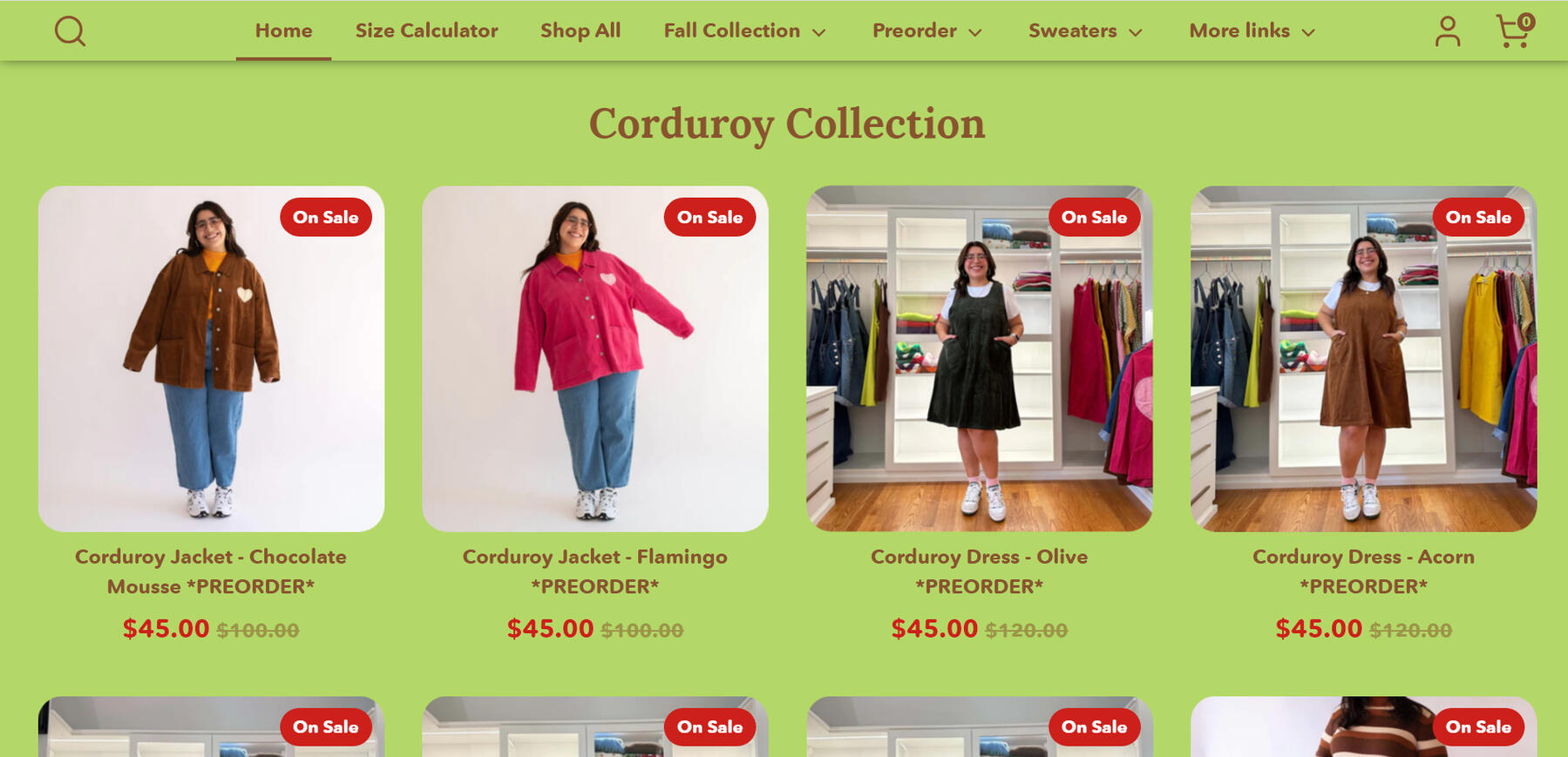
Shiny by Nature's navigation bar

Most participants relied on their prior knowledge of shopping websites to complete this task. In other online stores, a navigation bar typically has their products separated into categories (Shirts, Sweaters, Pants, etc.) for users to access. However, Shiny by Nature did not fit this mental model, with these links nested two (or sometimes three) layers deep within the site, forcing the user to go into the "More Links" tab to get to their desired category.
Recommendations
While this task revealed flaws in the navigation process, this issue does not obstruct the site’s usability. As a result, we would give this task a severity ranking of Minor.Our team would recommend reformatting the navigation bar to include the site’s main clothing categories: Coats, Pants, Activewear, etc. Additionally, site features such as the Size Calculator and Tip Jar should be featured on the right of the navigation bar. Positioning these items to the right indicates that these categories are of lesser importance due to the left-to-right reading pattern followed by the Western world.
Task 2: According to these measurements—40 inches for the bust and 35 inches for the waist—calculate the desired size for the ‘Princess Dress.’
Findings
This task revealed an area of inconsistency and confusion within the site, as 3 of the 4 participants were unable to complete this task. These 3 participants followed the exact same route of selecting the “Size Calculator” feature (located prominently in the navigation bar). After analyzing this task during the post-testing period, it is possible the wording of this task played a major part in confusing participants. Asking users to “calculate” the desired size, caused them to click on the “Site Calculator.”The Site Calculator is an unfinished feature that is available on the site’s homepage. This calculator allows customers to select a specific product from a dropdown menu and then input their height, weight, bust, waist, and hip measurements to receive a size recommendation. However, due to the unfinished nature of this feature, the ‘Princess Dress’ is not available in the list of selectable products.By following this route, most participants were confused because they were not given a hip measurement to input within the form. Many selected what they considered to be the “next best option” from the list of selectable products (the Gingham Dress) and input a random hip measurement.In order to complete this task properly, participants would have to navigate to the ‘Princess Dress’ product, scroll through the product description, and find the “Size Chart” that is specifically made for the ‘Princess Dress.’ Participant 3 was the only one who completed this task successfully using this method and spent the shortest amount of time completing it (1 minute 18 seconds).

The Shiny by Nature size calculator

The Princess dress size chart


The chart on the right more closely aligns with the information we gave our participants (bust and waist measurements) and produces a different result (size L) from using the Size Calculator on the left (size M).
Recommendations
Admittedly, the wording of this task (the use of the word ‘calculate’) likely confused our participants, leading to their inability to complete this task. However, the prominent appearance of the unfinished Size Calculator on the homepage may also have attracted users’ attention, causing them to navigate to this feature to complete the task. This discrepancy does not obstruct the site’s usability, and as a result, we would give this task a severity ranking of Minor.Our team would recommend removing the Site Calculator from the homepage and embedding it within the miscellaneous “More Links” category. Alternatively, if the site owner prefers to keep the Size Calculator on the homepage, including a prominent “Beta” descriptor in the title will inform users that the calculator does not yet include all products.Another possible change would be to make the Size Chart stand out more in the product description. This can be done either by enlarging the font size or changing the color to draw more attention to the Size Chart. Participant 3 reflected this advice in her comments regarding the website’s overall design: “I’d suggest changing the font color or size to make sure links stood out.”
Task 3: You want to initiate a return for an item you purchased. Find the price of a return label.
Findings
Each participant successfully completed this task with most participants following a similar path. Participants 1, 3, and 4 first accessed the “More Links” tab in the navigation bar. Participant 1 clicked the “Resources” link within this tab and scoured through each individual tab before finding the “Store Policies” link which led to the requested information (she expressed confusion throughout this entire process). Participant 3, on the other hand, avoided the “Resources” tab and selected the “Store Policy” link right away, leading her to the requested information. Participant 4 clicked the “More Links” tab and did not find the requested information. She then scrolled to the bottom of the site and accessed the “Refund and Store Policy” link from the footer. She was the only participant to access the ‘Returns and Exchange’ link using this route.Participant 2 followed an entirely different path from the other participants, as she did not use the “More Links” tab at all. Instead, Participant 2 selected a product, scrolled through the item’s description, and clicked the “Return and Exchange Policy” link found within the description. This led to the “Return and Exchange” page where the requested information was found. Participant 2 was the only participant to use this route.
Each participant successfully completed this task, with Participant 4 completing it the fastest (21 seconds) and with the smallest number of clicks required.
Recommendations
Having various routes to important site information is a positive feature of a webpage, but the ambiguity of some of the category names (such as “Resources”) proved to be confusing for users, giving this a Minor ranking. Naming categories differently may ameliorate confusion about where the store policy is located. As an example, the “Resources” tab could be renamed to “Help” since most of the articles under it are related to questions or requests for assistance.While Participant 4 completed the task the quickest, their first attempt to find the store policies was unsuccessful because many of the subcategories under “More Links” were hidden and had to be individually scrolled through. Being unable to find something on the first try is often deterring for users. As a result, we believe shortening the list of subcategories under “More Links” would diminish the risk of frustrating users.

The More Links tab with Store Policies buried far down the list

Task 4: Without using the search bar, find the original price of the “Tennis Skirt” in the color “Flamingo” before it was marked down to its current price.
Findings
By this point, many of our participants had grown accustomed to the site’s design and had adapted to its navigational structure (allowing the average time spent on this task to be less than a minute: 47 seconds). None of our participants searched for a “Skirts” category in the navigation bar as they had done with “Pants” in Task 1. Instead, all participants (apart from Participant 3) went to the “More Links” tab, located the “Tennis Skirt” within the “Skirts” dropdown menu, and gave the correct price. Participant 3 was the only one who selected the “Shop All” category from the navigation bar and used the product dropdown to search for “Tennis Skirts”; however, tennis skirts were not included in this section. Participant 3 navigated to the Clearance section, found the requested tennis skirt within this category, and gave the correct price.
Recommendations
Each participant successfully completed this task, though the Tennis Skirt (a clearance item) was not properly categorized within the Tennis Skirt section. This confused Participant 3 and made it difficult for her to complete the task. However, the product is still accessible, which leads our team to give this task a severity ranking of Minor.Cross-categorizing the Tennis Skirt (or any other clearance item) within their respective categories and the clearance section will allow users to follow multiple routes to access the same product.
Task 5: Locate the care guide for the “Puffer Jacket.”
Findings
Each participant followed a similar route to accomplish this task, which consisted of locating the puffer jacket through the navigation bar, selecting one of the jackets from the product listings, scrolling through the product description, then selecting the care guide from a link embedded within the description. Only Participant 2 accessed the “Fall Collection” tab on the navigation bar before going back and following the route listed above. Each participant managed to finish this task within less than a minute. During this task, Participant 3, who spent 58 seconds on this task (the longest time recorded) commented that the item descriptions are “very long”, which prevented her from finding the information as quickly as other participants.
Recommendations
Each participant successfully completed this task with minimal difficulty; thus, we would not give this task a severity ranking. However, Participant 3 stated that item descriptions are “very long” and that links do not stand out among other text. Participant 2 had conflicting feedback, stating that the underlined nature of the links provided a visual distinction from body text, making links easy to find. Additional research may be beneficial to understanding if a larger sampling of participants share Participant 3’s sentiments; however, the current data shows that Participant 3 may be an outlier.
Post-Test Analysis
In addition to completing a series of tasks, we also asked our participants to evaluate the Shiny by Nature website using the System Usability Scale (SUS) and a set of 118 Product Reaction Cards (PRC). The SUS is a ten-item questionnaire that utilizes Likert scale characteristics. The questionnaire poses statements such as: “I think that I would like to use this system frequently” or “I found the system unnecessarily complex,” and users must score their results from Strongly Agree to Strongly Disagree. Inputs are then added together and put through a calculation that converts them to a score between 0 and 100. SUS scores above a 68 are considered “above average.” Likewise, scores below 68 are considered “below average.”
The scores for our participants are recorded listed below:

Our participants' SUS scores

Based on this table, our participants’ responses are split down the middle. The score for Participants 1 and 3 stated that the site’s design and usability is “below average.” Conversely, Participants 2 and 4 gave the site an “above average” score.Additionally, our team utilized 118 unique PRC (product reaction cards) in order to evaluate the site. PRC are words or phrases that help participants articulate their emotional responses to a product. They could include positive words such as “friendly,” “accessible,” and “fresh,” negative words such as “boring,” “unprofessional,” and “intimidating,” or neutral words like “business-like,” “ordinary,” and “advanced.” The words were displayed at random inside a Google survey, and each participant chose 5 that best summed up their feelings about the website.
Their responses are as follows:

Our participants' PRC results

Positive vs. negative word proportions


These tables prove our participants’ responses are split down the middle. Participants 1 and 3 predominantly used negative words (3 negative, 2 positive) to describe the website, whereas Participants 2 and 4 used only positive words to describe the website. In general, all participants seemed to agree that the site was usable in some capacity. This is seen from the words: “usable”, “easy to use”, “simplistic”, and “clean” (a single word taken from each participant). Regarding the site’s design, we recorded the words: “consistent”, “organized”, “unrefined”, and “friendly” (a single word taken from each participant). We would recommend further research to discover “tie-breaking” results.
Conclusion
Based on these results, our team concludes that the site is usable, though improvements to its navigational structure and information architecture are recommended. Many participants faced similar difficulties when locating the ‘Be Yourself Pants’ from Task 1, as they all expected the navigation bar to include a section for ‘Pants,’ instead of finding this category nested a layer down within the ‘More Links’ tab or several layers down within the ‘Shop All’ tab. Participant 3 iterated multiple times throughout the test that all major clothing categories (“Shirts,” “Pants,” “Accessories”) should be in the navbar as opposed to “cluttering the ‘More Links’ section,” which is better suited to contain miscellaneous content. Incorporating this suggestion would allow Shiny by Nature to follow an organizational structure that better conforms to common e-commerce frameworks.Our team also noticed most participants struggled with finding the correct garment size when given specific measurements (Task 2). Perhaps this was due to a discrepancy in our team’s wording of the task; however, many participants were still unaware that the Princess Dress had a Size Chart embedded within its description. This observation was provided by Participant 3 who highlighted that lengthy product descriptions and lack of font differentiation between regular text and hyperlinks made it difficult to locate specific content.Based on the results of our usability test, we believe following our recommendations will enhance the site’s overall navigation and information architecture. Following these modifications, additional usability testing can be conducted to assess the effectiveness of these changes. Although we reached out to the business owner through email, we received no response and the site has since undergone major changes regarding visual design and usability.